Mix red and yellow, you get orange. Change the dosages, and there are dozens of different shades to make the house sparkle! Original, energetic, and warm, the orange color explores the whole palette of fire for a vibrant decoration.
1. Orange
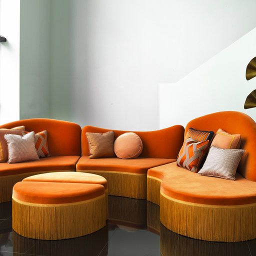
It is THE shade of orange by definition, the one that perfectly balances the quantities of yellow and red. It is also the warmest color of the color chart since it serves as a transition between two warm colors while yellow leads to green and red lead to blue, two cold shades!
2. Apricot
3. Aurora Orange
As much to warn you, aurora orange does not look like an orange but belongs to the family of its shades. It is an orange-yellow which, depending on its intensity, can sometimes be linked to shades of pink or yellow, and which has no equal to evoke a sunrise indoors.
4. Coral orange
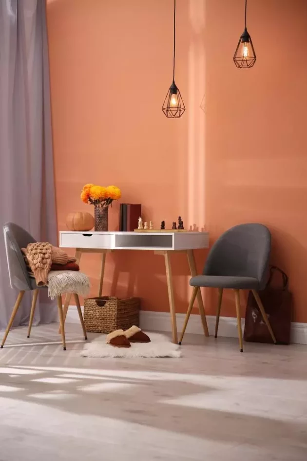
In the coral family, there are reds, pinks, and orange. The shade of coral orange and a bright barely pinkish-orange, joyful and luminous, which we love to combine with blue or sand beige for a seaside atmosphere.
5. Salmon orange
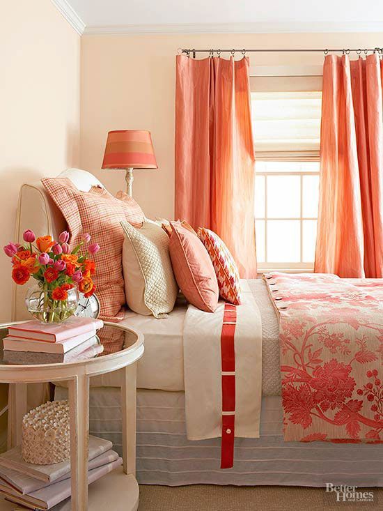
Soft and velvety, the salmon hue is an orange shade that’s easy to adopt without electrifying the decor. It retains all the warmth of the orange color, with a hint of pink and white. The result is a delicate, cozy, and warm shade that never hurts the eyes!
6. Melon Orange
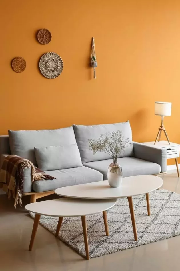
We expect a bright orange, and yet… The melon orange shade is more balanced in yellow, slightly off, almost closer to mustard yellow than an orange! But because it’s softer, it’s perfect with white, and why not black.
7. Burnt Orange
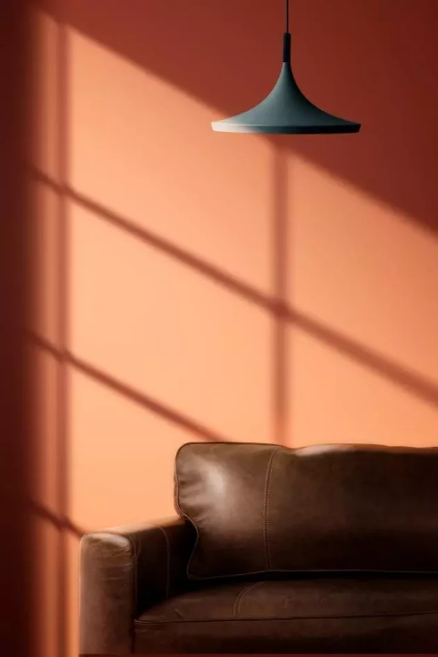
Although also browned, burnt orange is lighter and brighter than russet, but more subdued than a classic orange. Favorite in fashion as in decoration, it allows you to adopt the orange color in a softened version, to take advantage of its warmth without risking an overdose.
8. The tanned orange
Less bright than burnt orange, less red than red, and darker than copper, tanned orange approaches the chestnut family with its warm and deep hue. It blends nicely with the entire white palette, but can also be used in shades with other warm colors.
9. Maltese orange
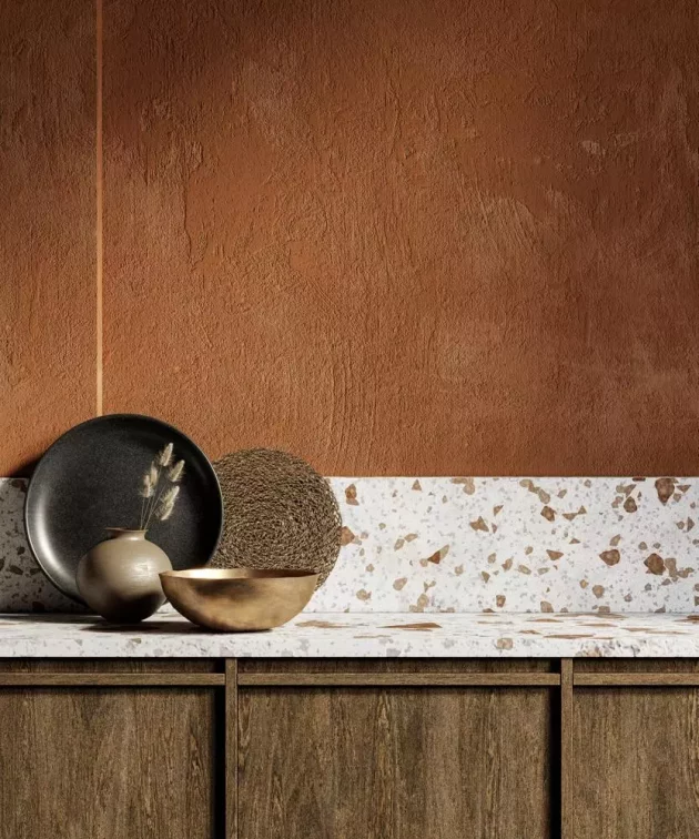
It’s all in the name, this shade of orange gets its hue from the flesh of Maltese oranges, half-blood oranges. A shade of burnished orange, close to terracotta, which therefore approaches terracotta and works wonders in a Mediterranean decor.

