We often talk about mid-century furniture, but this era is not just a question of furniture. It is a period that stands out for its innovation, especially when it comes to architecture. It is also a colorful movement. The period photos, in black and white, do not pay homage to them. Yet they were an integral part of the designers’ approach. These are bright, flamboyant colors that even more than 70 years later will bring good humor to your interior. So, how do you use mid-century colors in your decor?
MID-CENTURY RED AND ORANGE
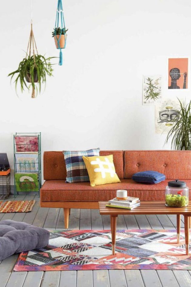
These are popular colors. They are perfect for highlighting detail as a whole and for catching the eye.
Question nuance, we have lively: bright orange, bright red. These are colors that can be found until the end of the mid-century “trend” in the 70s. We will also find shades a little softer and a little deeper, a little bit darker. Less flash, easier to live with.
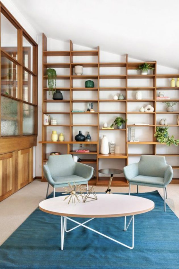
At this time, orange can also create contrast. We associate it with a light blue and we obtain a hot/cold contrast which will give your interior a decidedly retro side! This contrast is also characterized by the proportion of the colors. A large volume of cold color for a few pinches of warm color. We balance everything with white and wood.
MID-CENTURY YELLOW
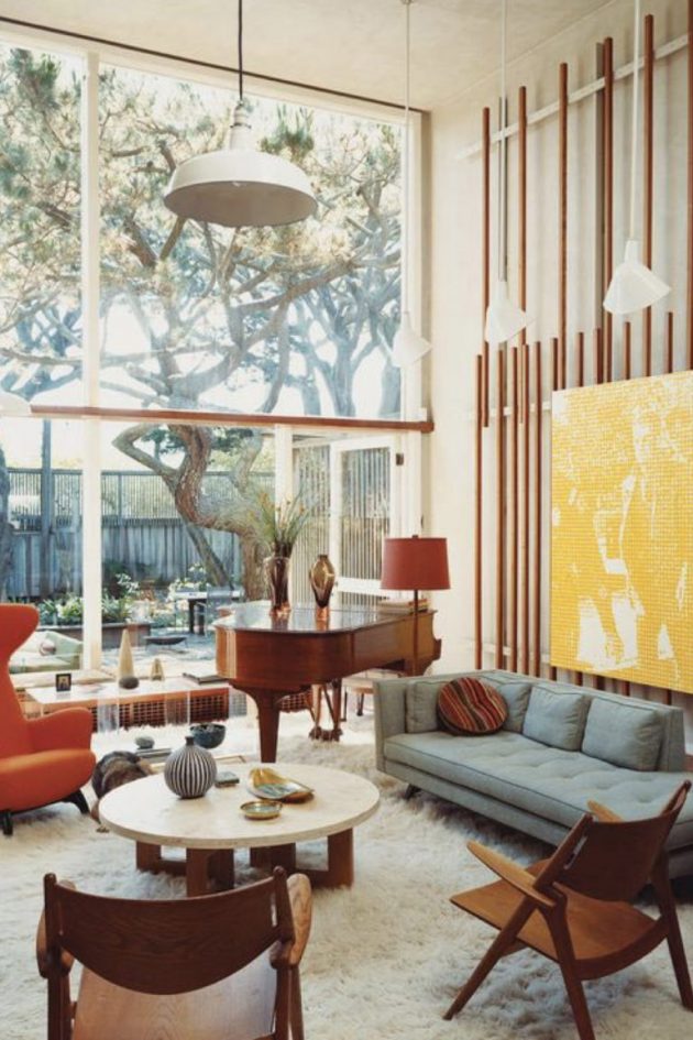
Another color that we find in the 50s is yellow. Solar color par excellence. She puts a touch of good humor in an interior that without her would be too austere. No need to do tons of it, whether in the 1950s or today. It is an ideal color to draw the eye to a specific point in the room.
MID-CENTURY GREEN
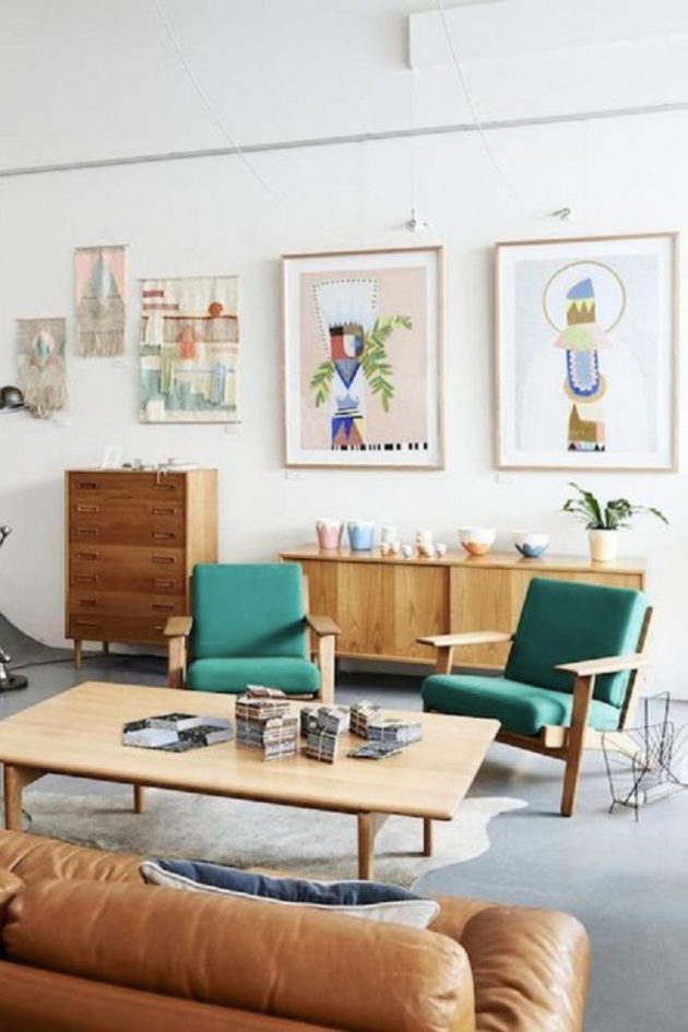
Green is a beautiful color and we like the mid-century period because the shades of green are amazing. They are not necessarily found on every street corner and they take us back decades in the past.
Mid-century green seems easy to integrate into your interior, even in our time. Green is synonymous with nature and it is a theme that is timeless. The combination of green + wood + white is easy and natural. She’s not going to be shocking. She’s not going to be amazing. This ease of living leaves more room for originality elsewhere. Take the example of an armchair with shapes that are out of the ordinary. If this armchair is red, we will only see him in the room but we will see the color above all, before its shape and design. If we chose the same chair in green this time. The color will challenge us but it will be forgotten to take full advantage of the shape of the armchair and its details.
MID-CENTURY BLUE
Generally, blue is a very popular color. Regardless of the shade, this color tends to be unanimous. It is often synonymous with freshness and softness. This color is also perhaps easier to use than others. Easier or we’re more used to it … we don’t know.
What about mid-century blue? Like the other colors, it can be used either in small touches or on an entire wall. The question of easy-going color arises precisely when it comes to large volumes of color. In mid-century settings, blue, even if it is associated with white, does not give a seaside effect. It is more astonishing. We will not necessarily expect to find blue to enhance an interior mainly composed of white and wood.
There isn’t a unique shade of blue to give your interior a 1950s look. But even if there isn’t a single reference, there are still some markers that you can spot that will help you make up your mind. We can start with pastel in a small touch. The risk with pastel is to fall into an interior that will make you think too much of Scandinavian decors, not from the 50s but those from a few years ago. In addition to the pastel, we can start with a sharper and more dynamic blue: an indigo blue, and oil blue, possibly a duck blue.

