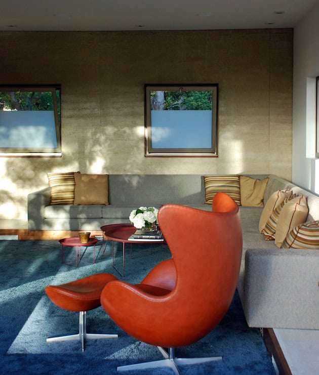
For all of those who get sick of color easily, they can be a difficult thing to incorporate into the home, especially for those who are a little less bold with color choices and are insecure what is wrong and correct.
Complementary combos are a great choice for combining multiple colors in one space without having to go too crazy or think too far outside of the box. While there’s no real rule when dealing with the hues of the rainbow. There are some steadfast combinations that are tried and true, just follow our tips and all your concerns will easily disappear. We are presenting you 5 easy tips which will for sure be helpful for a lot of you “in trouble” .

1. Don’t be afraid to mix patterns
When balancing color complements, try to mix florals with a stripe or a chevron and ikat pattern with a great solid wall. Mix them out with a solid neutral and keep the colors on the lighter and softer side. Let your imagination do the rest.
2. Let it all out
There are some situations, when bolder is better.It is not always like that but when it is, respect it and through this tip we are showing you how. Fuchsia and chartreuse, blocked with an orange and minty blue are all complements in their own right, but its taken a step further in combining multiple complements.

2. Standard is not always good
Spring is coming. Escape from the boring reality and bring some refreshment beyonde the standard borders. Sometimes colors such as red and green can be a little too reminiscent of particular holidays, sports teams, and even pairings in nature. Instead of thinking Christmas, go for a bright lime green and a rich orangey red. Spring is coming
4. The game of neutrality
Try to incorporate color complements into the scheme that a room already has going on by adding an armchair and a rug in its color complement. If doing this, though color complements will break away from the bland and boring world of greys, taupes, whites and blacks– that doesn’t mean to do away with them completely. Be careful!
5. Color refreshment
There is always something that is real, and on the other side something that we see. So there is a possibility that your room may already be colorful (in your eyes) but there might be a little bit of pizazz missing. Like the above photo, adding just two orange pillows to the scheme of things brings a whole new life to this sea-breezy light blue and neutral palette.And with this tip, we are encouraging you to bring one color to refresh your living are. By warming things up just a tad, the blues are instantly brighter and crisper.

