Robert Venturi the author of the now famous quote “Less is a Bore” passed away in 2018 from complications of Alzheimer’s disease; confirmed by deadorkicking.com. He has left behind a life-changing legacy in the field of architecture. He literally wrote the book on architecture at some points in his career. He reacted to the movement that architects were suffocating in known as the “modernist” movement.
The trend was to build simple structures and to strip these structures to the bare minimal. This became known as the “modernist” movement and was supposedly founded on the comment “Less is More” quoted by Ludwig Mies van der Rohe. Hence, there has been a decade’s long debate between the modernists and the post-modernists which was sparked from Venturi’s mantra “Less is a Bore”. We will explore the life of this remarkable architect.
Robert Venturi’s unorthodox building philosophy
Whether he really did revolutionize or rewrite the book on architecture is still being debated. He did radicalize architecture design when he started his illustrious career. His wife, Denise Scott Brown, and Robert designed structures that defied the parameters of conventional rationality. They did not believe that structures ever could be too simple or to superfluous and they truly designed some unique structures that still have architects scratching their heads even to this day.
He designed buildings that were full of humor and character with colorful urban landscapes defining these unusual structures. His designs brought warmth back into the field of architecture which seemed to be lost in the Modernist movement. This movement emphasized the coldness and logic of building simple yet humorless structures.
The Best of Robert Venturi
The Vanna Venturi House
Robert Venturi, was asked by his mother to build a house for her in the 1950’s. The house was planned and built on a property in Philadelphia, Pennsylvania and what a statement he made with the design of the house. The name of the house is “Vanna Venturi” and it is said to be the first “post-modernist house”. It looked like no other house built up to that time.
It was a blue house with a triangular front, and a useless arch in the front. Ironically, several features of the property drew from modernist architects Mies van der Rohe and Frank Lloyd Wright which is the very movement Venturi was rebelling against. But he added his own ornamental features to the structure of the house. This is where his design distinctly differed from the mainstream modernist thought of the time.
Robert Venturi, wrote “Some have said my mother’s house looks like a child’s drawing of a house – representing the fundamental aspects of shelter – gable roof, chimney, door and windows,” wrote Venturi in Architectural Record in 1982. “I like to think this is so.” The house became very famous as an architectural statement. It seems as if the house became a historical landmark in Philadelphia. This was his most famous project.

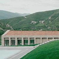
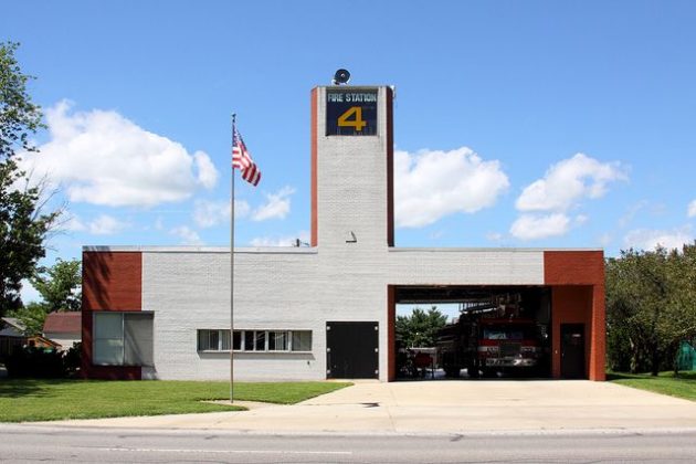
Columbus Ohio’s pride-Fire Station number 4
In the late 1960’s, Mr. Venturi was once again called upon to build a simple but unique-looking firehouse. He designed a very practical but unusual looking firehouse that made a stir, which all of his projects would do. He was asked to make a simple functioning structure that was “simple-looking and “easy to maintain” and he came through. He made a fire house that was as simple and practical as could be. It was very easy to maintain as well. It was built in 1968 and it still stands proudly in Columbus, Ohio to this day.
It is a simple structure that has the apparatus room on one side and the living quarters on the other side. A huge hose drying vent shoots straight into the sky and sits right in the middle of the structure. It has a large golden # 4 at the top. Both sides of the firehouse were symmetrical even though the space for the fire truck is much taller than the spaces for the offices. Also. The main part of the firehouse was designed with white bricks in mind then suddenly there are red bricks inserted on the very outer edges.
You cannot get simpler and easier to maintain than this building is. You have the living quarters on one side and the equipment room on the other side. Everything is compact and orderly in structure. Columbus, Ohio was pleased with their firehouse.
England’s Finest Hour
He was offered the project to add an addition to the National Gallery in London. It was dubbed the Sainsbury wing and it was completed in 1991. The original structure was designed by William Wilkins in 1838.
Venturi, structured the steps in front of the addition to weave backwards so they would be more accessible to visitors. It definitely did not mimic the original structure of the gallery. His wife assisted him on this particular project. The steps also had large cut outs that followed the pattern of the street. Venturi did keep some symmetry with the original structure by choosing Portland limestone to complement the look of the original structure.
Inside the addition, a glass wall offers views of Wilkins structure and the Trafalgar Square. The three galleries within the addition are arranged in 3 different sizes and are connected by arches. In true Venturi style, the spaces were never equally sized.
Seattle Calls
Again, Venturi was awarded another major project in 1991. This time Seattle Washington came knocking at his door. He came through in flying colors by designing a replacement to the existing museum. Terracotta tile wraps around the bottom of the curved limestone that greets visitors as they walk up the stairs leading to the main entrance. This a signature design of the architect’s post-modern flurry.
A marble and terrazzo stairway lead up to the front entrance designed to match the slope of the site. The stairway is cascaded with natural light shining through windows that face south. His design was chosen to replace the old structure.
Venturi, says he was inspired to design the structure from visiting Venice, Italy. There the art is actually brought right out to the street. But in the United States he could not bring the art to the streets. So, he did the next best thing. He brought the art as far down to the street as he could by making the art open and inviting.
Creativity for the Children
This museum was designed in Houston, Texas for children. In 1992, this architectural design came to life. In all honesty, the building looks like it was designed by a child. Which speaks to Venturi’s creative abilities. You cannot help but see this structure because it stands out with such a creative flair.
Large, bold, yellow columns support a pediment in front of the building. The architect studied child psychology books to get the feel for the design that would appeal to the younger crowd. He succeeded because like it was mentioned earlier it looks like the structure was designed by a child.
The structure is 4100 square feet which are supposed to symbolize early development which is the whole theme of the museum. The front colonnade reveals a large window in front while smaller flattened versions, running along the side of the building, seem to be holding up the letters that spell out the name of the structure.
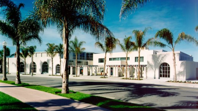
The Grand San Diego Structure
This extension to the Museum of Contemporary Art San Diego, was christened in 1996. This time Venturi’s firm teamed up with another firm to complete the extension. Since 1915, the structure had been extended many times. This time Robert Venturi added a courtyard among other features. The courtyard was in front of a colonnade along a very active Prospect street. The space was called a “well-loved urban space because the addition created a sheltered space.
The museum plans to demolish Venturi’s additions so they can renovate the museum and create new additions. These plans are very controversial in the architecture community and earlier in 2018, a petition was filed to stop the destruction of the additions.
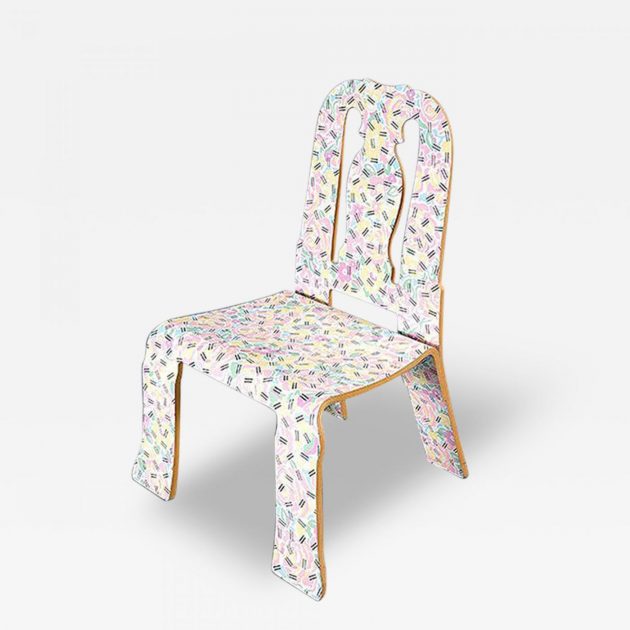
A Royal but Small Creation
Robert Venturi, ventured into designing furniture as well. In 1984, he collaborated with Scott Brown, to create a line of chairs for Knoll. One such chair was the Queen Anne chair. The duo took 51/2 years to refine a process in which they flattened traditional forms and just left the silhouette. They then coated the chairs with colorful patterns.
The Queen Anne chair is one such brightly-colored creation the team came up with. In an interview in 2017, Scott Brown said, “A vision that Bob had… was that you should be able to use industrial production methods to make furniture, which is also reminiscent historically.” “And that decoration is part of communication.”
The Final Thought
Robert Venturi, died at the age of 93 but not before he revolutionized the architectural world and turned it on its modernist ear. Before he came along, architecture was in a modernist or minimalist frame of mind. Architects designed buildings in simple forms with as little substance as possible. The driving mantra was “less is more” a very paradoxical phrase to say the least.
Robert Venturi, would have none of it and started a whole new movement in the field. He designed what became to be known as the post-modernist movement that took over the traditional way of thinking in the profession.
His designs were colorful and imaginative laced with humorous expression in the design itself. He created 7 famous structures which we have discussed in this article. His wife played a major role in his creations. He was one of the most influential architects (if not the most influential architect) in the 20th century. He left an indelible mark on the industry that will not soon be forgotten.